Random Head Dumps

Using Sass to Streamline a Css Ribbon.

For a simple listing page I was working on, I needed some sort of ribbon to depict a status for that listing item. Having seen lots of ribbons on various web pages I went shopping for some pre-made nice looking ribbons. I was using Sass as a css preprocessor and sass-bootstrap for rapid prototyping so sure enough, the first google result for sass bootstrap ribbon yielded a rejected bootstrap issue with a working jsfiddle for a nice green ribbon.

This is the css on that fiddle:

1
2
3
4
5
6
7
8
9
10
11
12
13
14
15
16
17
18
19
20
21
22
23
24
25
26
27
28
29
30
31
32
33
34
35
36
37
38
39
40
41
42
43
44
45
46
47
48
49
50
51
.ribbon-wrapper {
  width: 85px;
  height: 88px;
  overflow: hidden;
  position: absolute;
  top: -3px;
  right: -3px;
  z-index: 9999;
}

.ribbon {
  font: bold 15px Sans-Serif;
  color: #333;
  text-align: center;
  text-shadow: rgba(255,255,255,0.5) 0px 1px 0px;
  -webkit-transform: rotate(45deg);
  -moz-transform:    rotate(45deg);
  -ms-transform:     rotate(45deg);
  -o-transform:      rotate(45deg);
  position: relative;
  padding: 7px 0;
  left: -5px;
  top: 15px;
  width: 120px;
  background-color: #BFDC7A;
  background-image: -webkit-gradient(linear, left top, left bottom, from(#BFDC7A), to(#8EBF45));
  background-image: -webkit-linear-gradient(top, #BFDC7A, #8EBF45);
  background-image:    -moz-linear-gradient(top, #BFDC7A, #8EBF45);
  background-image:     -ms-linear-gradient(top, #BFDC7A, #8EBF45);
  background-image:      -o-linear-gradient(top, #BFDC7A, #8EBF45);
  color: #6a6340;
  -webkit-box-shadow: 0px 0px 3px rgba(0,0,0,0.3);
  -moz-box-shadow:    0px 0px 3px rgba(0,0,0,0.3);
  box-shadow:         0px 0px 3px rgba(0,0,0,0.3);
}

.ribbon:before, .ribbon:after {
  content: "";
  border-top:   3px solid #6e8900;
  border-left:  3px solid transparent;
  border-right: 3px solid transparent;
  position:absolute;
  bottom: -3px;
}

.ribbon:before {
  left: 0;
}
.ribbon:after {
  right: 0;
}

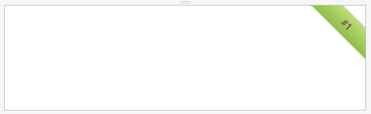
And it produces a nice looking ribbon stuck to the top right of the page:

Original ribbon

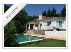
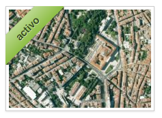
With some minor modifications I adapted the css to apply the ribbon to every item on the listing instead of the whole page. Also, I needed several colored ribbons representing different listing states. The result was pretty spiffy:

Active ribbon Deleted ribbon Inactive ribbon

But the css was growing to be a huge mess of repeated and inflexible code. For each new color needed, I had to find the right gradient and text colors, and repeat some css in an ever growing exercise of copy/paste. This was becomming pretty ugly, pretty fast:

1
2
3
4
5
6
7
8
9
10
11
12
13
14
15
16
17
18
19
20
21
22
23
24
25
26
27
28
29
30
31
32
33
34
35
36
37
38
39
40
41
42
43
44
45
46
47
48
49
50
51
52
53
54
55
56
57
58
59
60
61
62
63
64
65
66
67
68
69
70
71
.ribbon-wrapper {
  width: 106px;
  height: 93px;
  overflow: hidden;
  position: absolute;
  z-index: 9999;
}

.ribbon {
  font: bold 15px Sans-Serif;
  color: #333;
  text-align: center;
  text-shadow: rgba(255,255,255,0.5) 0px 1px 0px;
  -webkit-transform: rotate(-45deg);
  -moz-transform:    rotate(-45deg);
  -ms-transform:     rotate(-45deg);
  -o-transform:      rotate(-45deg);
  position: relative;
  padding: 7px 0;
  left: -28px;
  top: 17px;
  width: 120px;
  -webkit-box-shadow: 0px 0px 3px rgba(0,0,0,0.3);
  -moz-box-shadow:    0px 0px 3px rgba(0,0,0,0.3);
  box-shadow:         0px 0px 3px rgba(0,0,0,0.3);

}

.active {
  color: #6e8900;
  background-color: #BFDC7A;
  background-image: -webkit-gradient(linear, left top, left bottom, from(#BFDC7A), to(#8EBF45));
  background-image: -webkit-linear-gradient(top, #BFDC7A, #8EBF45);
  background-image:    -moz-linear-gradient(top, #BFDC7A, #8EBF45);
  background-image:     -ms-linear-gradient(top, #BFDC7A, #8EBF45);
  background-image:      -o-linear-gradient(top, #BFDC7A, #8EBF45);
}
.refused {
  color: #6e8900;
  background-color: #EE5F5B;
  background-image: -webkit-gradient(linear, left top, left bottom, from(#EE5F5B), to(#BD362F));
  background-image: -webkit-linear-gradient(top, #EE5F5B, #BD362F);
  background-image:    -moz-linear-gradient(top, #EE5F5B, #BD362F);
  background-image:     -ms-linear-gradient(top, #EE5F5B, #BD362F);
  background-image:      -o-linear-gradient(top, #EE5F5B, #BD362F);
}
.inactive {
  color: #6e8900;
  background-color: #FFFFFF;
  background-image: -webkit-gradient(linear, left top, left bottom, from(#FFFFFF), to(#E6E6E6));
  background-image: -webkit-linear-gradient(top, #FFFFFF, #E6E6E6);
  background-image:    -moz-linear-gradient(top, #FFFFFF, #E6E6E6);
  background-image:     -ms-linear-gradient(top, #FFFFFF, #E6E6E6);
  background-image:      -o-linear-gradient(top, #FFFFFF, #E6E6E6);
}

.ribbon:before, .ribbon:after {
  content: "";
  border-top:   3px solid #6e8900;
  border-left:  3px solid transparent;
  border-right: 3px solid transparent;
  position:absolute;
  bottom: -3px;
}

.ribbon:before {
  left: 0;
}
.ribbon:after {
  right: 0;
}

Sass to the rescue

Let’s refactor this code using the some nice Sass features and some ready-made mixins provided by sass-bootstrap.

Removing vendor prefixes

The low hanging fruit is the vendor prefixes that we can reduce by using some sass-bootstrap mixins. You can get a list of bootstrap provided mixins in the _mixins.scss file. Mixins are like modules of code that can be included in other rules. They can even take arguments to further customize the included code. Take for example the sass-bootstrap rotate mixin:

1
2
3
4
5
6
7
@mixin rotate($degrees) {
  -webkit-transform: rotate($degrees);
     -moz-transform: rotate($degrees);
      -ms-transform: rotate($degrees);
       -o-transform: rotate($degrees);
          transform: rotate($degrees);
}

This scss syntax defines a mixin rotate that takes the variable $degrees as an argument . When you include this mixin in another rule like this:

1
2
3
4
.diagonal {
  color: white;
  @include rotate(-45deg);
}

the mixin gets expanded (mixed in) in that rule:

1
2
3
4
5
6
7
8
.diagonal {
  color: white;
  -webkit-transform: rotate(-45deg);
     -moz-transform: rotate(-45deg);
      -ms-transform: rotate(-45deg);
       -o-transform: rotate(-45deg);
          transform: rotate(-45deg);
}

So using the available sass-bootstrap mixins, these rather verbose rules

1
2
3
4
5
6
7
8
9
10
11
12
13
14
  -webkit-transform: rotate(-45deg);
  -moz-transform:    rotate(-45deg);
  -ms-transform:     rotate(-45deg);
  -o-transform:      rotate(-45deg);

  -webkit-box-shadow: 0px 0px 3px rgba(0,0,0,0.3);
  -moz-box-shadow:    0px 0px 3px rgba(0,0,0,0.3);
  box-shadow:         0px 0px 3px rgba(0,0,0,0.3);

  background-image: -webkit-gradient(linear, left top, left bottom, from(#FFFFFF), to(#E6E6E6));
  background-image: -webkit-linear-gradient(top, #FFFFFF, #E6E6E6);
  background-image:    -moz-linear-gradient(top, #FFFFFF, #E6E6E6);
  background-image:     -ms-linear-gradient(top, #FFFFFF, #E6E6E6);
  background-image:      -o-linear-gradient(top, #FFFFFF, #E6E6E6);

can be replaced by these that will generate the same output

1
2
3
  @include rotate(-45deg);
  @include box-shadow(0px 0px 3px rgba(0,0,0,0.3));
  @include gradient-vertical(#FFFFFF, #E6E6E6);

Creating a mixin for the ribbon color

One annoyance I faced when adding other ribbon colors for different status, was that I needed to pick three colors to define the new ribbon: a base color, a lighter color for the gradient and a darker color for the text and ribbon folds. Sass provides some functions to do color math, like lighten and darken that we could use to avoid having to specify three different colors. So I created a mixin that receives a base color, calculates both a lighter and darker versions of that color and assigns the resulting colors to variables that are used in the relevant places. Also used the & operator to reference the parent selector of the rule this mixin will be included in.

1
2
3
4
5
6
7
8
9
10
  @mixin ribbon-color($ribbon_base_color) {
    $ribbon_darker_color: darken($ribbon_base_color, 30);
    $ribbon_lighter_color: lighten($ribbon_base_color, 20);

    color: $ribbon_darker_color;
    @include gradient-vertical($ribbon_lighter_color, $ribbon_base_color);
    &:before, &:after {
      border-top:   3px solid $ribbon_darker_color;
    }
  }

With this mixin we can define a ribbon color just by specifying the base color like this:

1
2
3
  &.active {
    @include ribbon-color(#8EBF45);
  }

The final result is much more manageable.

1
2
3
4
5
6
7
8
9
10
11
12
13
14
15
16
17
18
19
20
21
22
23
24
25
26
27
28
29
30
31
32
33
34
35
36
37
38
39
40
41
42
43
44
45
46
47
48
49
50
51
52
53
54
55
56
57
58
59
.ribbon-wrapper {
  width: 106px;
  height: 93px;
  overflow: hidden;
  position: absolute;
  z-index: 9999;
}

.ribbon {
  font: bold 15px Sans-Serif;
  color: #333;
  text-align: center;
  text-shadow: rgba(255,255,255,0.5) 0px 1px 0px;
  position: relative;
  padding: 7px 0;
  left: -28px;
  top: 17px;
  width: 120px;
  @include rotate(-45deg);
  @include box-shadow(0px 0px 3px rgba(0,0,0,0.3));

  @mixin ribbon-color($ribbon_base_color) {
    $ribbon_darker_color: darken($ribbon_base_color, 30);
    $ribbon_lighter_color: lighten($ribbon_base_color, 20);

    color: $ribbon_darker_color;
    @include gradient-vertical($ribbon_lighter_color, $ribbon_base_color);
    &:before, &:after {
      border-top:   3px solid $ribbon_darker_color;
    }
  }

  &.active {
    @include ribbon-color(#8EBF45);
  }
  &.refused {
    @include ribbon-color(#BD362F);
  }
  &.inactive {
    @include ribbon-color(#E6E6E6);
  }
  &.deleted {
    @include ribbon-color(#ff780b);
  }
  &:before, &:after {
    content: "";
    border-left:  3px solid transparent;
    border-right: 3px solid transparent;
    position:absolute;
    bottom: -3px;
  }
  &:before {
    left: 0;
  }
  &:after {
    right: 0;
  }

}

There are probably other improvements to this code, but I’m pretty happy with the results. Once you start using a css preprocessor like Sass, and realizing its power you cannot go back to plain css anymore.

Waiting for Completed Ajax in Capybara and Other Tricks.

Capybara 2.1 does a pretty good job waiting for elements to appear or disapear from the page you’re testing. Every Capybara finder method (find_field, find_button), or action method that depends on finding something (fill_in, choose, check), or even querying methods (has_content?, has_css?) have a built-in waiting mechanism explained in the README. Essentially, Capybara will wait for the specified element to appear or disapear from the page, before asserting or performing the required action. The amount of time to wait is configurable. For example, if you have this (artificial) test:

1
2
3
4
5
visit 'http://www.wikipedia.org/'
fill_in 'search', with: 'Lisbon'
click_button '→'
puts find('#firstHeading').text
# outputs 'Lisbon'

Capybara will wait for an element with name or id search to appear on the page before filling it with Lisbon. After that it will wait for the button labeled to apear on the page before clicking it. Finally, it will wait for the element with a CSS id of firstHeading to appear on the page for the find action.

This is all very good if you know what to wait for in the first place. If clicking a button triggers some Ajax call that fills some select element with random data, you will have some trouble knowing what to wait for.

For these situations you can add the following code to your testing harness to wait for completed Ajax requests.

1
2
3
4
5
6
7
// Add this to every javascript in testing mode
if (window.jQuery) {
  _ajax_sent      = 0; // number of sent ajax requests
  _ajax_completed = 0; // number of completed ajax requests
  $(document).ajaxSend(function(e, x, s) { _ajax_sent++; });
  $(document).ajaxComplete(function(e, x, s) { _ajax_completed++; });
}

This first snippet adds two custom Ajax counters that will increment for each sent and completed request.

1
2
3
4
5
6
7
8
9
10
11
12
13
14
15
16
# Add this to a new file
# spec/support/capybara_helpers.rb
module CapybaraHelpers
  def waiting_for_completed_ajax(seconds = Capybara.default_wait_time)
    ajax_sent = page.evaluate_script("_ajax_sent").to_i
    yield
    raise "No Ajax request sent after action. Can't wait for completed Ajax." if ajax_sent == page.evaluate_script("_ajax_sent").to_i
    Timeout::timeout(seconds) do
      until( page.evaluate_script "_ajax_sent == _ajax_completed" ) do
        sleep 0.1
      end
    end
  rescue Timeout::Error
    raise "Ajax request didn't complete in #{seconds} seconds (sent requests: #{page.evaluate_script('_ajax_sent')}, completed requests: #{page.evaluate_script('_ajax_completed')})"
  end
end

This snippet defines a helper method that takes a block. The method checks that the action present on the block triggers an Ajax call and waits for that call to finish. You then include it in your testing framework of choice. For example in RSpec, configure it this way:

1
2
3
4
5
6
# spec/spec_helper.rb
require 'support/capybara_helpers'

RSpec.configure do |config|
  config.include(CapybaraHelpers)
end

And then use it like this:

1
2
3
4
5
6
visit '/'
waiting_for_completed_ajax do
  click_button 'generate_random_options'
end
first_option = first('#roulette option').text
select first_option, from: 'roulette'

Bear in mind that if you have lots of background activity firing Ajax calls this method may not work as expected. This was designed for waiting for Ajax requests triggered by some action, and may not work reliably in other situations.

The way that you include the needed javascript in your testing environment is up to you, as this depends heavily on your testing setup. In my case I have a special javascript file that gets included in all javascript bundles if the project is in “testing mode”.

Also in testing mode, a lot of external services are turned off, or mocked out, like facebook, google analytics and adsense, and other metrics tools. This will increase the reliability of your tests, because you are removing an external source of entropy that you do not control and that can interfere with the outcome of your tests. As a bonus, they will run faster.

As a final note, in testing mode I also include this snippet in all javascript bundles:

1
if (window.jQuery) { jQuery.fx.off = true; }

This will turn off all jQuery animations and speed up your integration tests. More importantly, it will increase their reliability because stuff is not moving around while you’re trying to click it. This is especially important if you’re using Poltergeist to drive PhantomJS as it has an advanced click behaviour explained in the README. Poltergeist asks the browser (PhantomJS) the coordinates of an element to click, and then tries to click on those coordinates. If you’re using jQuery animations, the element may be moving around and the click will fail. If you turn off animations with jQuery.fx.off these problems will go away and you’ll have snappier tests because you’re not waiting for the animations to reach their final state.

These tricks have increased the reliability and speed of my integration tests. I hope it helps yours too.

Putting Some Twilight on Octopress

So, this blog runs on Octopress which is great, but the default solarized syntax highlighting is… how to put this gently… colorful in a non-pleasant way. This is how code looks with the default theme:

Octopress Solarized Syntax Highlighting

So I decided to change that to my prefered Twilight theme from Sublime Text 2:

1
2
3
4
5
6
7
8
9
10
11
12
13
14
15
16
17
18
19
20
class Float
  def number_decimal_places
    self.to_s.length-2
  end
  def to_fraction
    higher = 10**self.number_decimal_places
    lower = self*higher
    gcden = greatest_common_divisor(higher, lower)

    return (lower/gcden).round, (higher/gcden).round
  end

private
  def greatest_common_divisor(a, b)
     while a%b != 0
       a,b = b.round,(a%b).round
     end
     return b
  end
end

Phew! Bland and pastel colors > Bright and screaming colors. Much better!

There is a blog post from Alejandra Estanislao on how to do this but it goes a little too far, replacing the syntax highlighting engine of octopress from Pygments to CodeRay. I didn’t want to do that (Pygments is a fine syntax highlighter) so, I digged a little deeper and found this twilight_pigments.css gist by Dan Simpson.

With this in hand I’ve set out to discover where to put it inside octopress. The pygments syntax highlighting css rules are buried deep inside sass/partials/_syntax.scss nested in a .pre-code class. You can put custom scss in sass/custom/_styles.scss as this file will be imported last, and will override other styles in the cascade.

So I’ve adapted the twilight pigmets css to scss, changed .pre.code to .pre-code, added !important everywhere, changed some colors using Sublime Text 2 as a reference and ended up with this:

1
2
3
4
5
6
7
8
9
10
11
12
13
14
15
16
17
18
19
20
21
22
23
24
25
26
27
28
29
30
31
32
33
34
35
36
37
38
39
40
41
42
43
44
45
46
47
48
49
50
51
52
53
54
55
56
57
58
59
60
61
62
63
64
65
66
67
68
69
70
71
72
73
74
75
76
// This File is imported last, and will override other styles in the cascade
// Add styles here to make changes without digging in too much

.pre-code {
  font-family: Consolas, Monaco,"Lucida Console";
  overflow: scroll;
  overflow-y: hidden;
  display: block;
  padding: .8em;
  overflow-x: auto;
  line-height: 1.45em;
  background: #181818 !important;
  color: #F8F8F8 !important;
  span { color: #F8F8F8 !important; }
  span { font-style: normal !important; font-weight: normal !important; }

  .hll { background-color: #ffffcc !important }
  .c { color: #5F5A60 !important; font-style: italic !important } /* Comment */
  .err { border:#B22518; } /* Error */
  .k { color: #CDA869 !important } /* Keyword */
  .cm { color: #5F5A60 !important; font-style: italic !important } /* Comment.Multiline */
  .cp { color: #5F5A60 !important } /* Comment.Preproc */
  .c1 { color: #5F5A60 !important; font-style: italic !important } /* Comment.Single */
  .cs { color: #5F5A60 !important; font-style: italic !important } /* Comment.Special */
  .gd { background: #420E09 } /* Generic.Deleted */
  .ge { font-style: italic !important } /* Generic.Emph */
  .gr { background: #B22518 } /* Generic.Error */
  .gh { color: #000080 !important; font-weight: bold !important } /* Generic.Heading */
  .gi { background: #253B22 } /* Generic.Inserted */
  .go {  } /* Generic.Output */
  .gp { font-weight: bold !important } /* Generic.Prompt */
  .gs { font-weight: bold !important } /* Generic.Strong */
  .gu { color: #800080 !important; font-weight: bold !important } /* Generic.Subheading */
  .gt {  } /* Generic.Traceback */
  .kc {  } /* Keyword.Constant */
  .kd { color: #e9df8f !important;  } /* Keyword.Declaration */
  .kn {  } /* Keyword.Namespace */
  .kp { color: #CF6A4C !important } /* Keyword.Pseudo */
  .kr {  } /* Keyword.Reserved */
  .kt {  } /* Keyword.Type */
  .m { } /* Literal.Number */
  .s { color: #8F9D6A !important } /* Literal.String */
  .na { color: #F9EE98 !important } /* Name.Attribute */
  .nb { color: #CDA869 !important } /* Name.Builtin */
  .nc { color: #9B703F !important; font-weight: bold !important } /* Name.Class */
  .no { color: #7587A6 !important } /* Name.Constant */
  .nd { color: #7587A6 !important } /* Name.Decorator */
  .ni { color: #CF6A4C !important; font-weight: bold !important } /* Name.Entity */
  .nf { color: #9B703F !important; font-weight: bold !important } /* Name.Function */
  .nn { color: #9B703F !important; font-weight: bold !important } /* Name.Namespace */
  .nt { color: #CDA869 !important; font-weight: bold !important } /* Name.Tag */
  .nv { color: #7587A6 !important } /* Name.Variable */
  .o { color: #CDA869 !important } /* Operator */
  .ow { color: #AA22FF !important; font-weight: bold !important } /* Operator.Word */
  .w { color: #141414 !important } /* Text.Whitespace */
  .mf { color: #CF6A4C !important } /* Literal.Number.Float */
  .mh { color: #CF6A4C !important } /* Literal.Number.Hex */
  .mi { color: #CF6A4C !important } /* Literal.Number.Integer */
  .mo { color: #CF6A4C !important } /* Literal.Number.Oct */
  .sb { color: #8F9D6A !important } /* Literal.String.Backtick */
  .sc { color: #8F9D6A !important } /* Literal.String.Char */
  .sd { color: #8F9D6A !important; font-style: italic !important; } /* Literal.String.Doc */
  .s2 { color: #8F9D6A !important } /* Literal.String.Double */
  .se { color: #F9EE98 !important; font-weight: bold !important; } /* Literal.String.Escape */
  .sh { color: #8F9D6A !important } /* Literal.String.Heredoc */
  .si { color: #DAEFA3 !important; font-weight: bold !important; } /* Literal.String.Interpol */
  .sx { color: #8F9D6A !important } /* Literal.String.Other */
  .sr { color: #E9C062 !important } /* Literal.String.Regex */
  .s1 { color: #8F9D6A !important } /* Literal.String.Single */
  .ss { color: #CF6A4C !important } /* Literal.String.Symbol */
  .bp { color: #00aaaa !important } /* Name.Builtin.Pseudo */
  .vc { color: #7587A6 !important } /* Name.Variable.Class */
  .vg { color: #7587A6 !important } /* Name.Variable.Global */
  .vi { color: #7587A6 !important } /* Name.Variable.Instance */
  .il { color: #009999 !important } /* Literal.Number.Integer.Long */
}

I had to remove the whole .pre-code block inside sass/partials/_syntax.scss because some styles kept bleeding through the css cascade and I didn’t want to waste more time chasing after them. You can see the complete commit in GitHub.

The syntax highlighting is not exactly the same as Sublime’s but is pretty close. And there you have it, beautiful code in Octopress.

Firefox: Same Origin Policy Woes With Private Adress Ranges

Suppose you have an html page and you want to embed an SVG in it for later manipulation. One of the possible ways to do it is using an object tag like this:

1
2
3
4
5
<div id="the_logo">
  <object type="image/svg+xml" data="images/awesome_logo.svg" id="awesome_logo">
    You're missing out on an Awesome logo with that old browser!
  </object>
</div>

And using some javascript to manipulate, say, a node’s opacity:

1
2
3
4
5
6
7
function fade_out_lettering(){
  // Get the svg content document embedded in out document 
  var svg = document.getElementById('awesome_logo').contentDocument;

  // use jQuery to select an SVG element, using svg as the search context
  $('#lettering',svg).animate({opacity: 0});
}

Now, suppose that you use private addresses in the context of your development environment. You access your development (virtual) machine using some ip address in Chrome:

http://10.0.0.10:3000/

And you see your glorious svg logo lose it’s letters in a nice fade. Check with Safari, and the same beautiful experience. Check with firefox, aaaaaand… nothing! Open up the inspector and you’ll see something like this (or similar):

Firefox

What the hell? Permission denied in the context of access to embedded documents (iframes, svgs…) usually means violations of the same origin policy, but in this case the contents are all local, and share the same protocol, host and port number. Besides, it works on all other cool browsers! What’s going on?

Well, it seems firefox has some issues checking same origin policy with private adresses (or is it any ip address?). Just to validate this theory, use an ip-to-name tool like xip.io to check the page again. You access your development maching using a name instead of an ip address:

10.0.0.10.xip.io:3000/

And voilà! The letters also fade in firefox (version 21 in my case)! So now you can deploy your shiny logo confident that it will work when your users view it served from production machines. I’m assuming you do use a domain name for your site…

This firefox idiosyncrasy applies to embedded svgs, but also to iframes, and probably to any other object you can embed in your page.

Hat tip to @luismreis for the xip.io trick. Thanks!